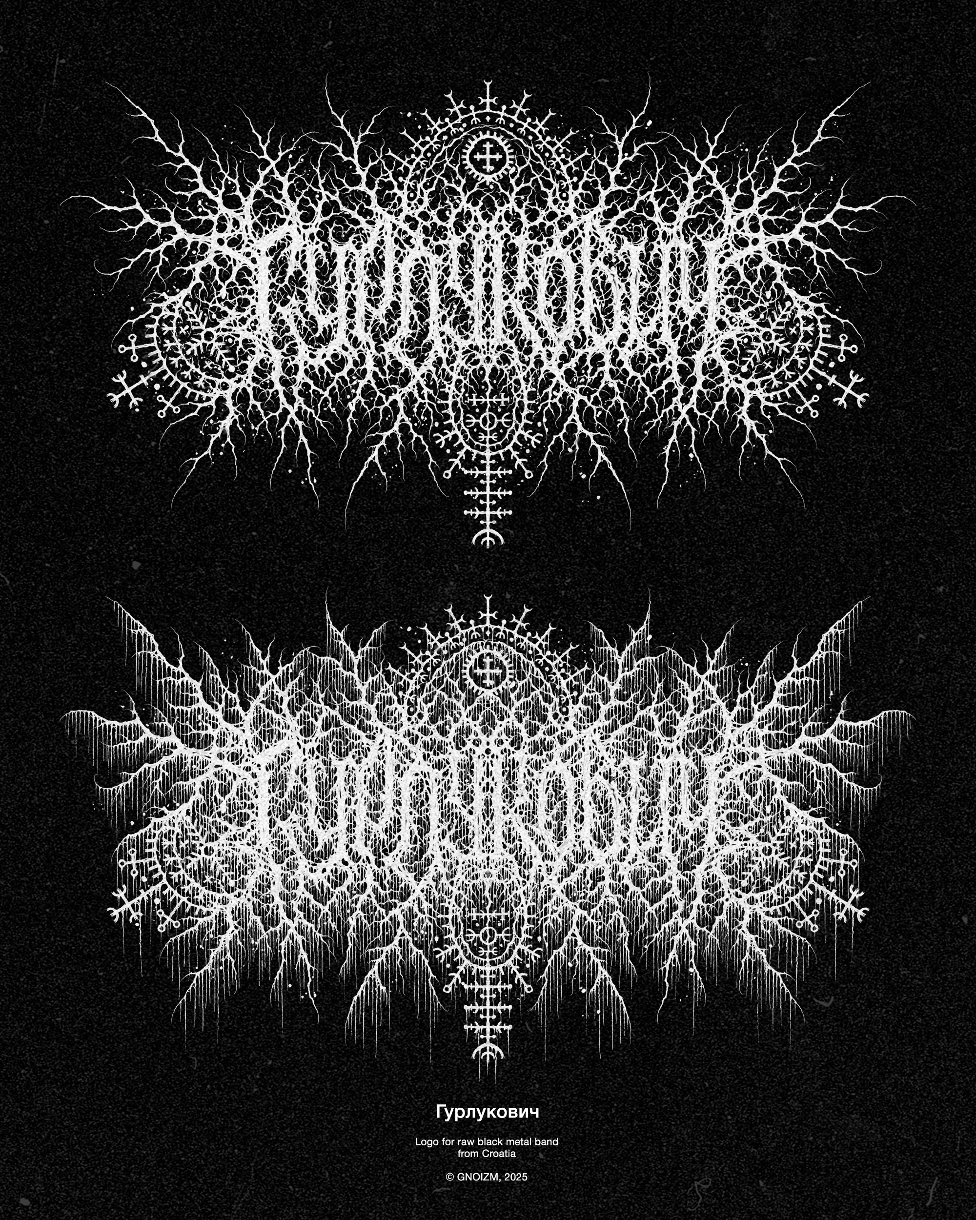
Logo for raw black metal band from Croatia.
Here, I needed to create a chaotic mess of branches and drips while incorporating sigils from traditional Croatian patterns. The second task posed no issues, but the first one was a challenge: initially, I wanted to make the logo asymmetrical, thinking it would provide more room for chaos, but it just wouldn’t come together into a satisfying image. In the end, I settled on a completely symmetrical composition, as it turned out that without order, there can be no chaos…
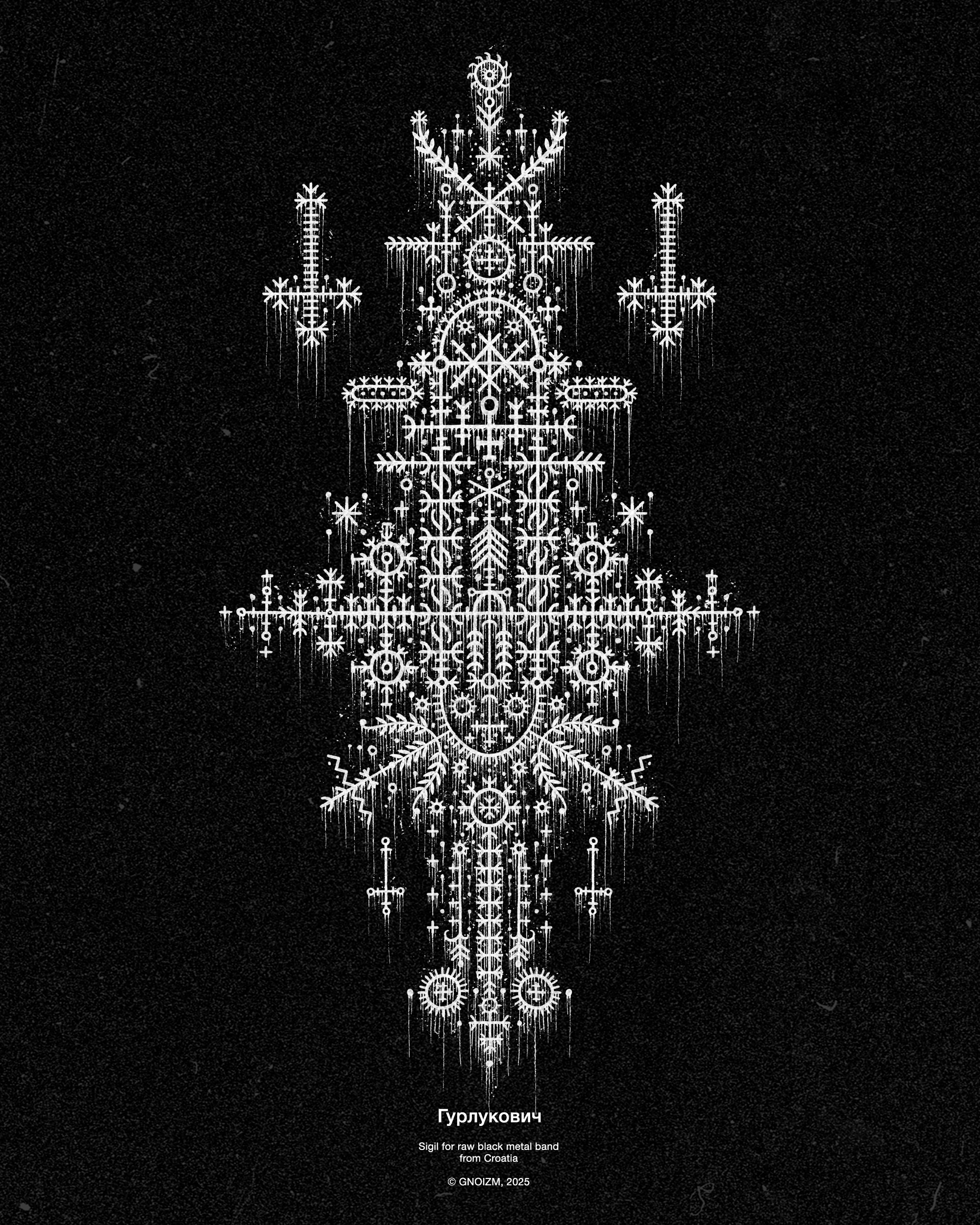
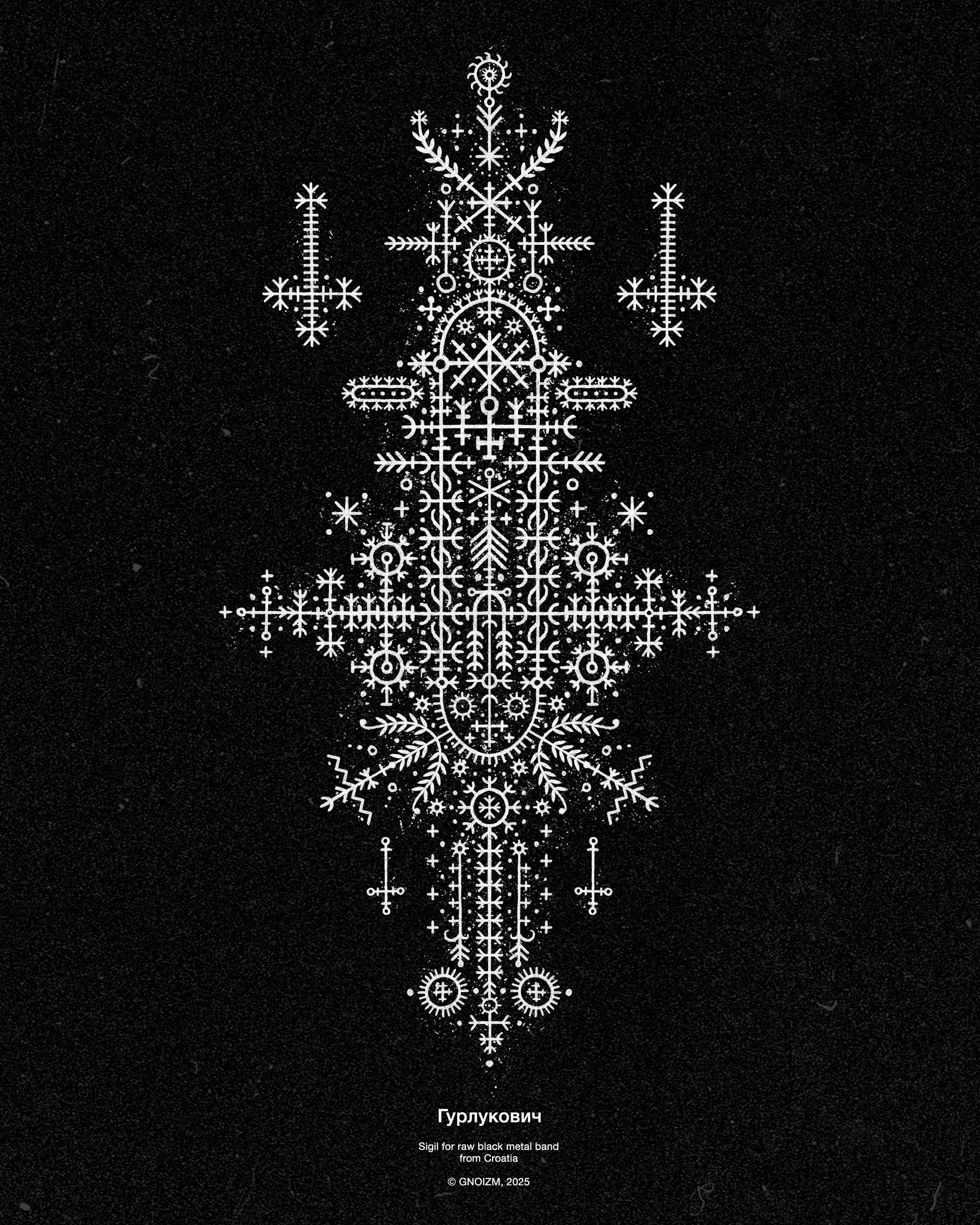
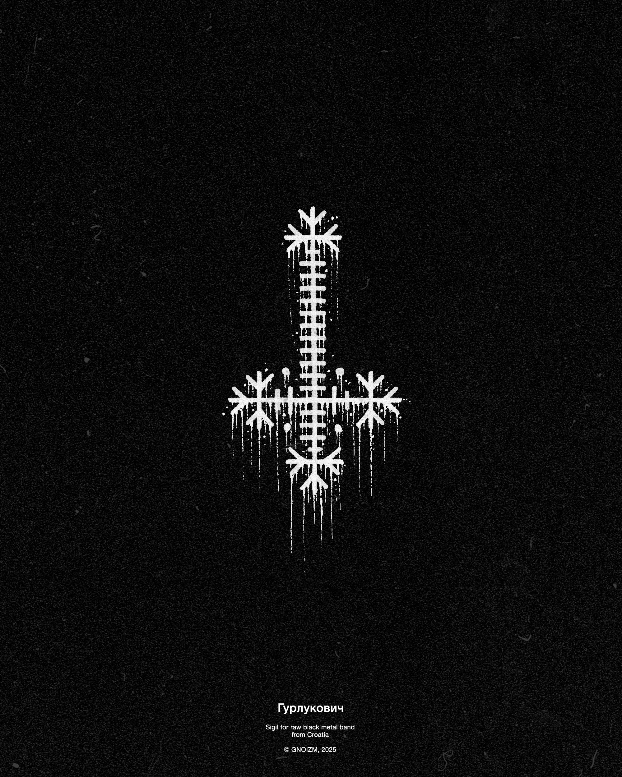
Also for Gurlukovich, I designed a sigil pattern that utilizes the same motifs found in traditional Croatian patterns. The sigil was executed both in a “grungy” variation with a wall of drips and in a cleaner version.


Infernal hails brother and thank you for all that you have done for us.