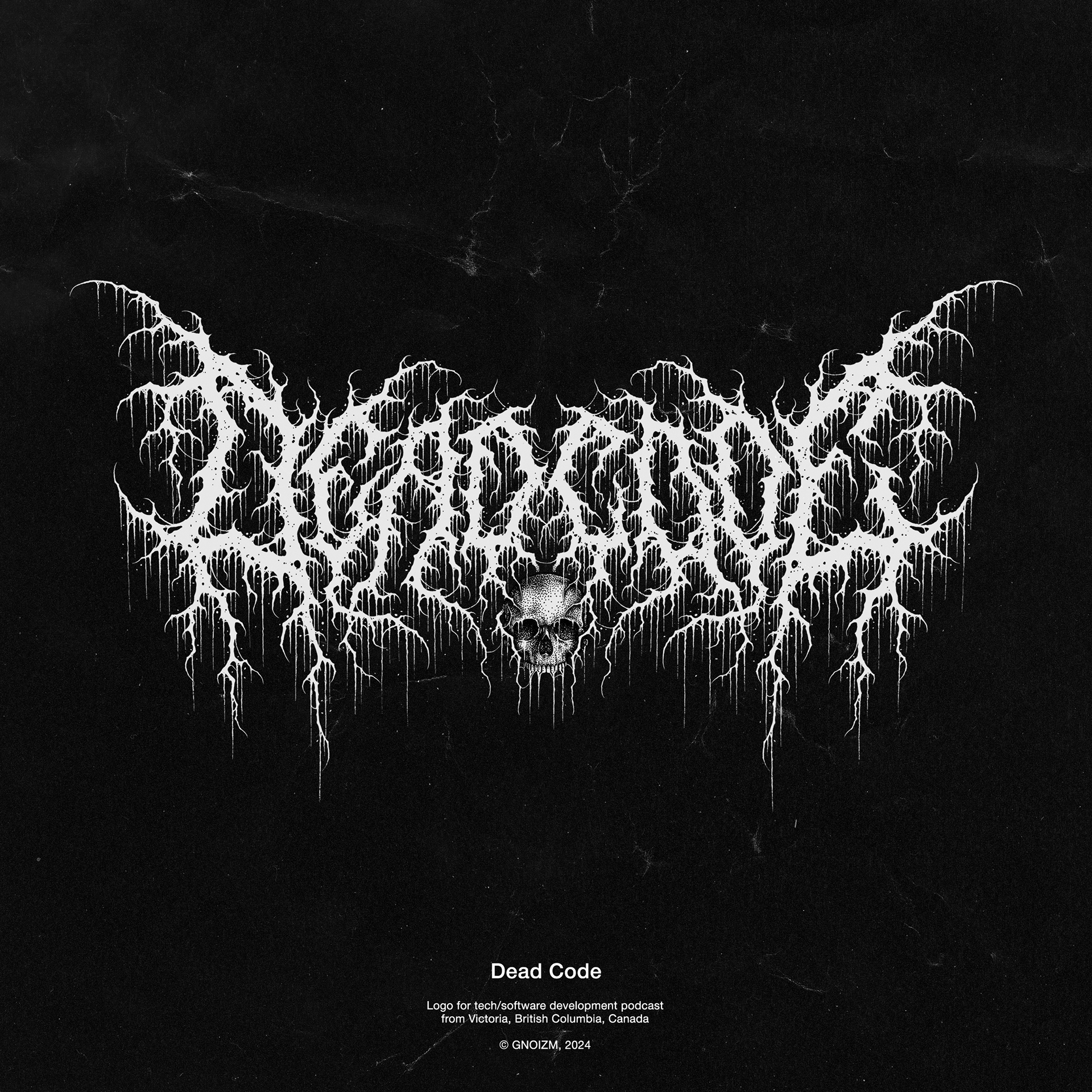
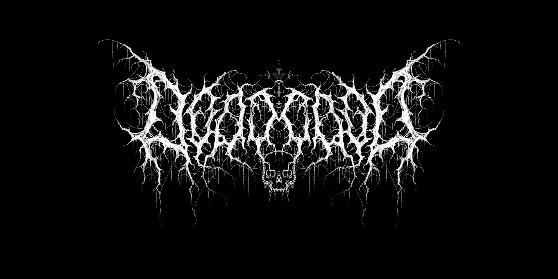
Logo for tech development podcast from Victoria, BC, Canada.
Despite the podcast’s theme, Jared (its creator), as a big metal fan, wanted to use a metal aesthetic for his branding, and his main goal was to get a logo like a real metal band — which is why he reached out to me.
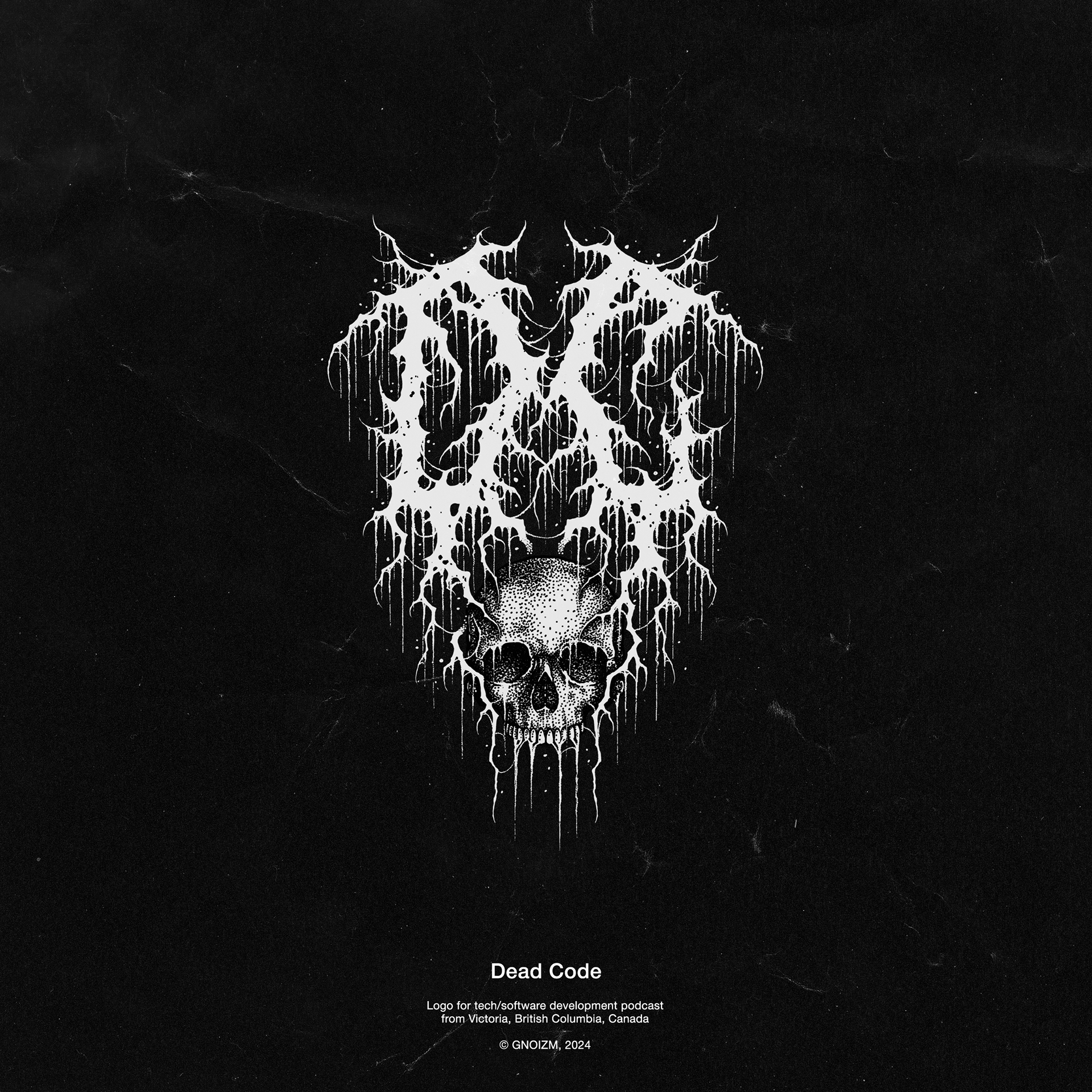
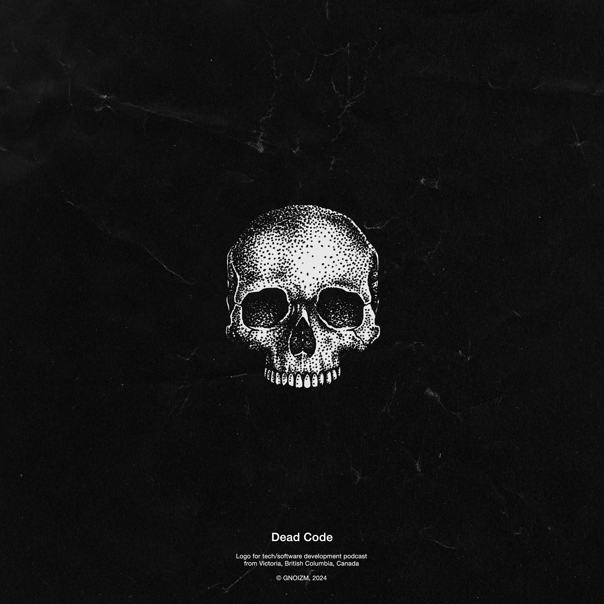
We quickly arrived at a stylistic solution that combines the rawness and filth of black metal aesthetics with relatively good legibility and a high level of detail in the logo. The composition was built in such a way that the central letters can also be used as the podcast’s initials in an emblem. As a bonus, the skull can be used separately for various graphic applications.
Sketches
Timelapse
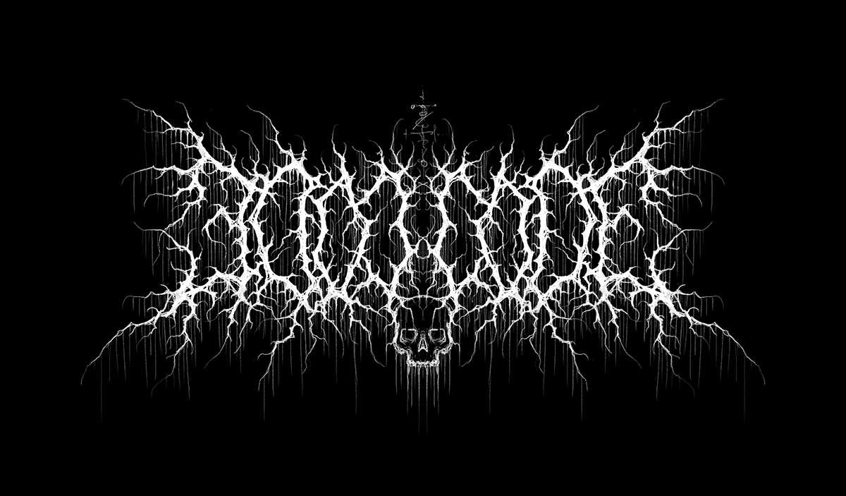
Final Results