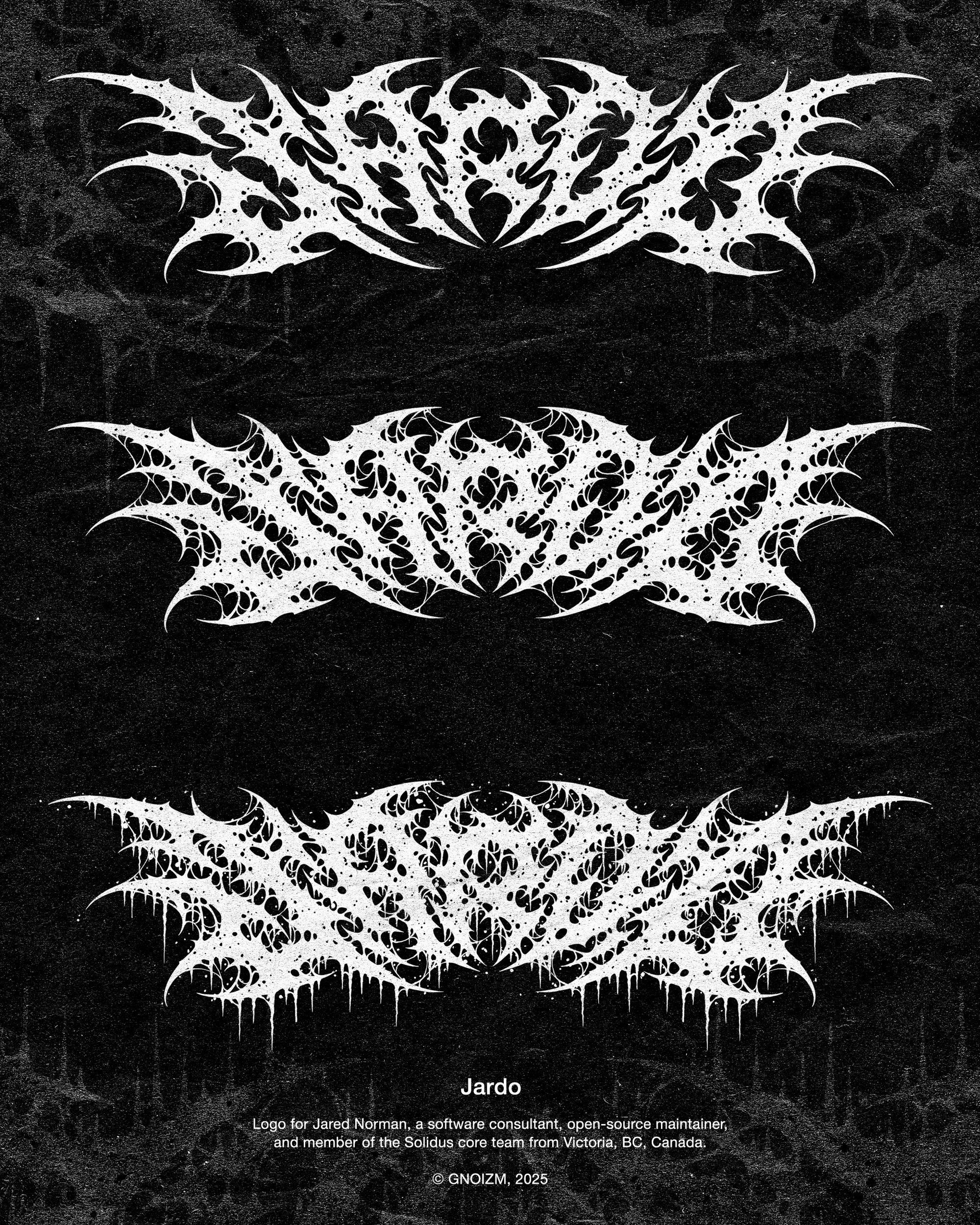
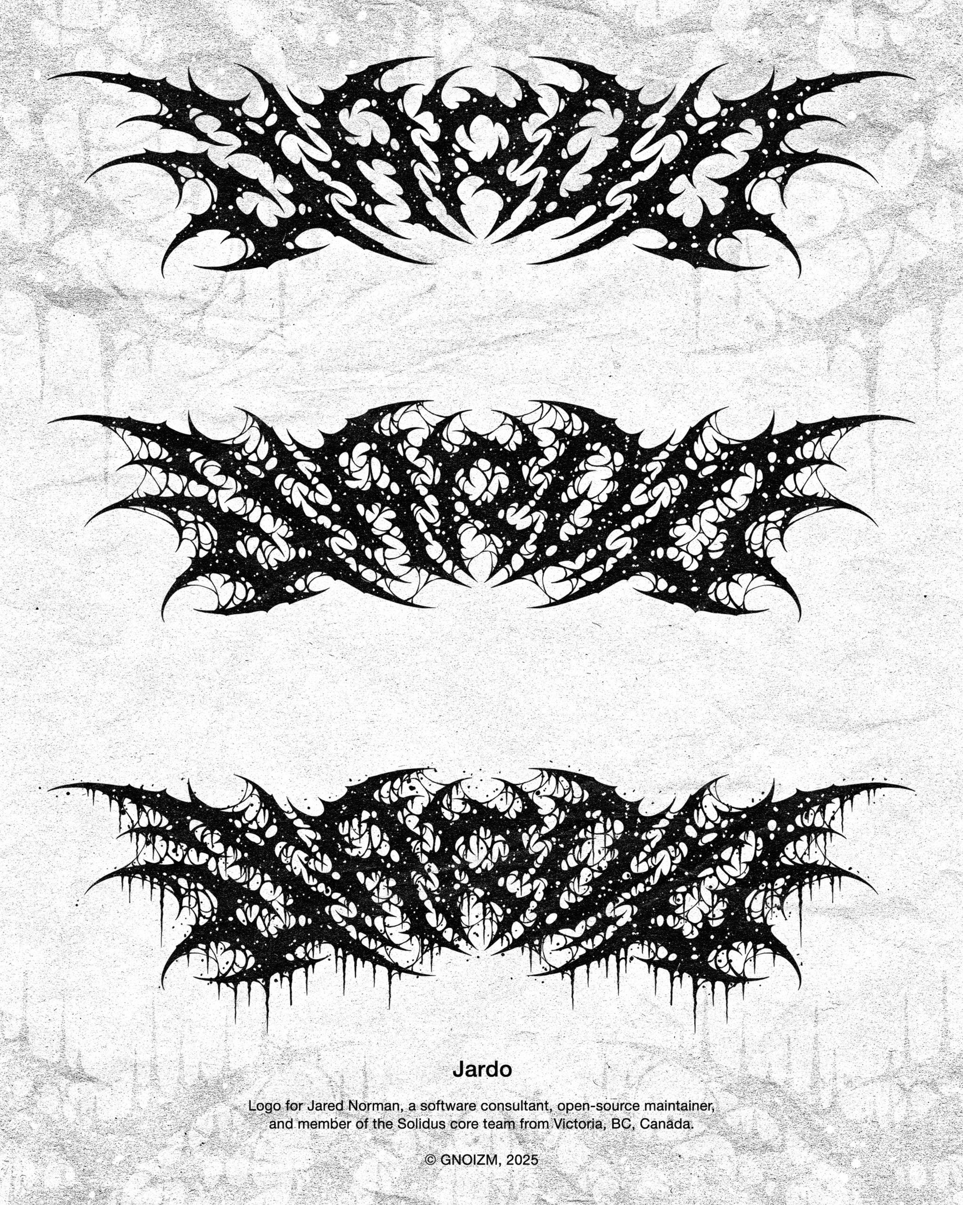
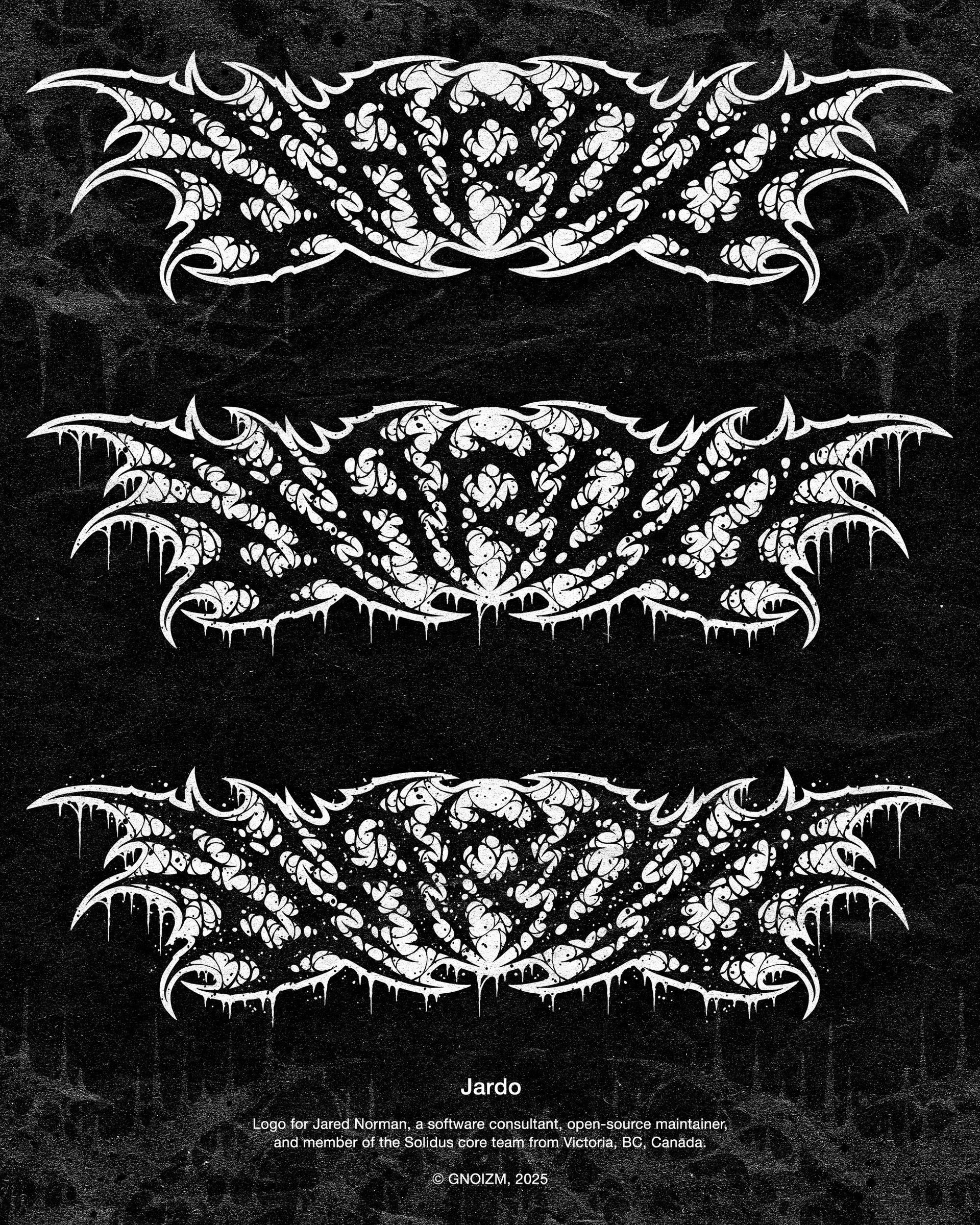
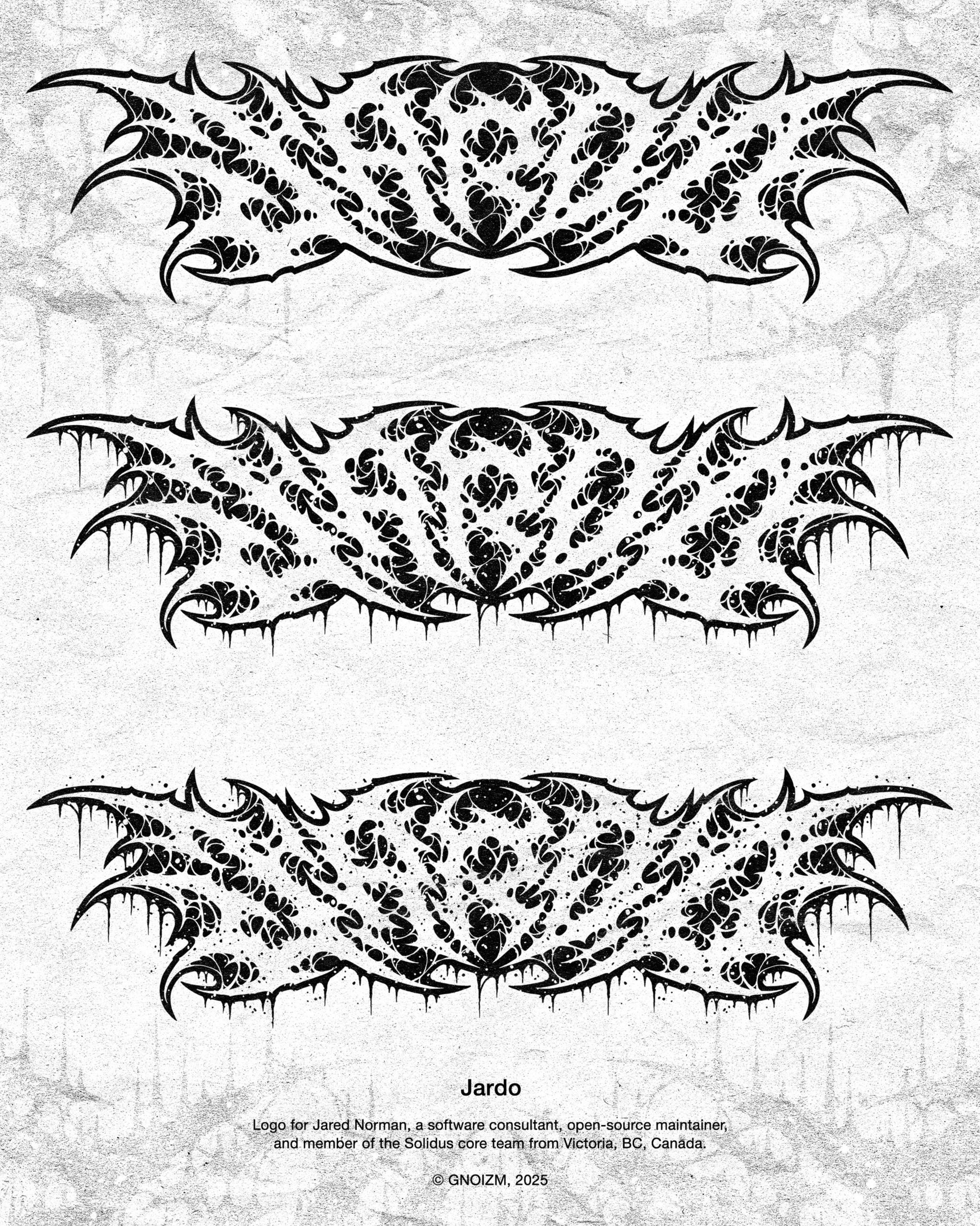
Personal logo for Jared Norman, IT professional from Canada.
This is the third logo we made for Jared. This time it’s a readable death metal logo for his personal brand. Jared’s comments regarding his wishes for the logo were as follows:
For the “Jardo” one, the most important thing is that it mostly fits the proportions of the existing wordmark on my site. The letters don’t have to be the same size/shape or anything, but the logo is going to be used in spaces that are roughly a 4:1 aspect ratio as I’ll be swapping it out for certain uses. I’ll also be using it in spots that might be even smaller than the current size of the wordmark on the site, so like I said, I don’t really care about legibility too much, but I want it to look good at that size. I guess the other thing to note is that unlike the other logo, I may use this on light backgrounds sometimes, so it’ll have to look good inverted too.
You’ve nailed this one if it gets mistaken for the logo of a brutal death metal band. I’m kind of hoping for something with a more spikey, death metal feel to it.